


Jeremie Hornus retweeted

Meet Vesterbro Arabic! An extension of the beloved Vesterbro family, it carries the same warmth and expressiveness into Arabic script. Designed by Hirbod Lotfian, it balances contrast, elegance, and fluidity—perfect for branding, editorial, and more.
black-foundry.com/arch/fonts/vest…

Jeremie Hornus retweeted
Excited to launch Vesterbro Arabic!
Designed by Hirbod Lotfian , it brings the expressive charm of Vesterbro to Arabic script, blending contrast & calligraphic elegance. A perfect fit for branding, editorial & more. Explore it now!
black-foundry.com/arch/fonts/vest…


Jeremie Hornus retweeted
Say hello to Vesterbro Arabic! A seamless blend of contrast, fluidity & tradition designed for Arabic, Persian, Urdu & Kurdish. Now available on our website.
black-foundry.com/arch/fonts/vest…


Jeremie Hornus retweeted
Checkout the Japanese Kana of Fat, from our East Asian font collection, designed by Yuxin Li.
Fat is the embodiment of boldness in the world of display fonts! Every glyph is so incredibly fat that it captures attention instantly.
cjk.black-foundry.com/black-…


Feeling much better glancing here since i discovered the « this post doesn’t interest me » feature… seems it’s working
Jeremie Hornus retweeted
Introducing Arcadio, a Latin-Chinese type family in our East Asian font collection.
Explore more about Arcadio, as well as our other East Asian fonts currently under development, in our Black[CJK] catalogue on our website.
cjk.black-foundry.com/black-…


Jeremie Hornus retweeted
Discover our Work in Progress Grtsk Chinese in the CJK section of our website
cjk.black-foundry.com/black-…
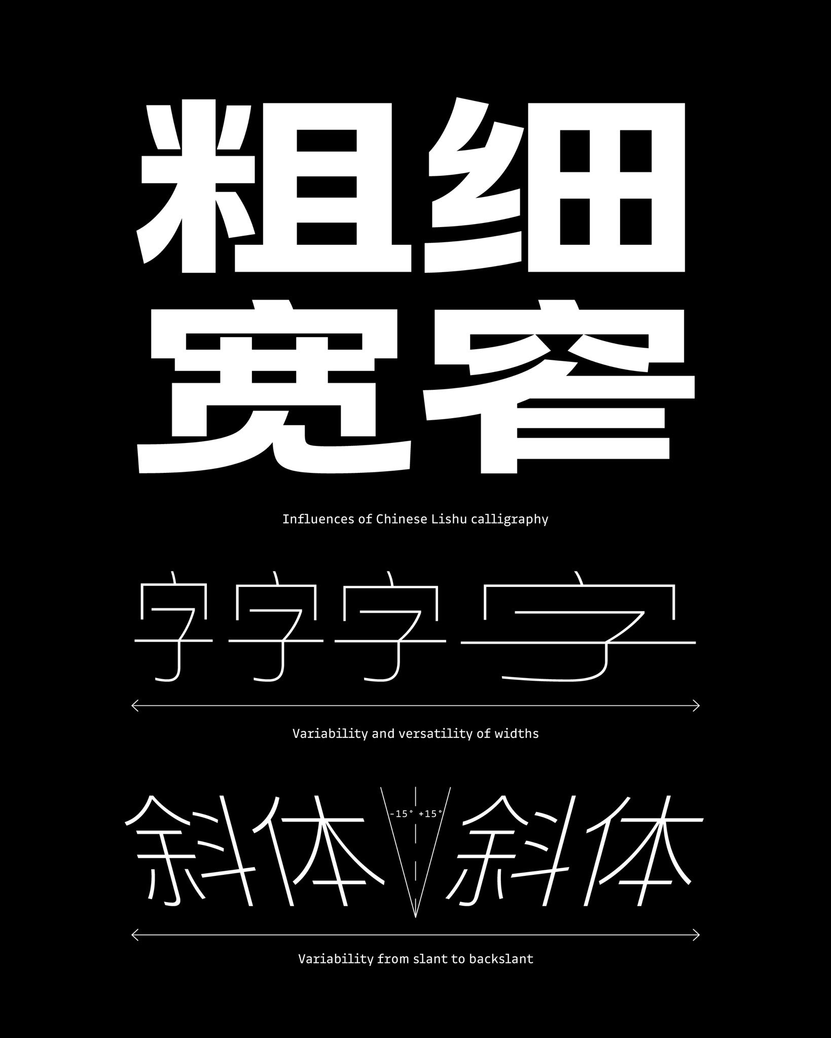


Pushing boundaries, Close up.
Highlighting the letters swapping when Mono with grid visiblility.
3 axes of variation:
Monospaced ↔ Proportional
Normal ↔ Extended Swashes
Light ↔ ExtraBold
Thanks @Fontra_xyz


Jeremie Hornus retweeted
Here’s a quick preview of Vesterbro in Chinese and Japanese writing systems.
Explore more of our East Asian fonts in the CJK section of our website.
cjk.black-foundry.com/black-…


Jeremie Hornus retweeted
After introducing our Arabic catalog, we are excited to share a sneak peek of our CJK font library, featuring Chinese, Japanese, and Korean typefaces currently in development.
Link 👇
cjk.black-foundry.com/black-…


Jeremie Hornus retweeted
Having fun with Variable Font. From Proportional to Mono, and with extending swashes axis too. What do you think? Should we develop further?


Jeremie Hornus retweeted
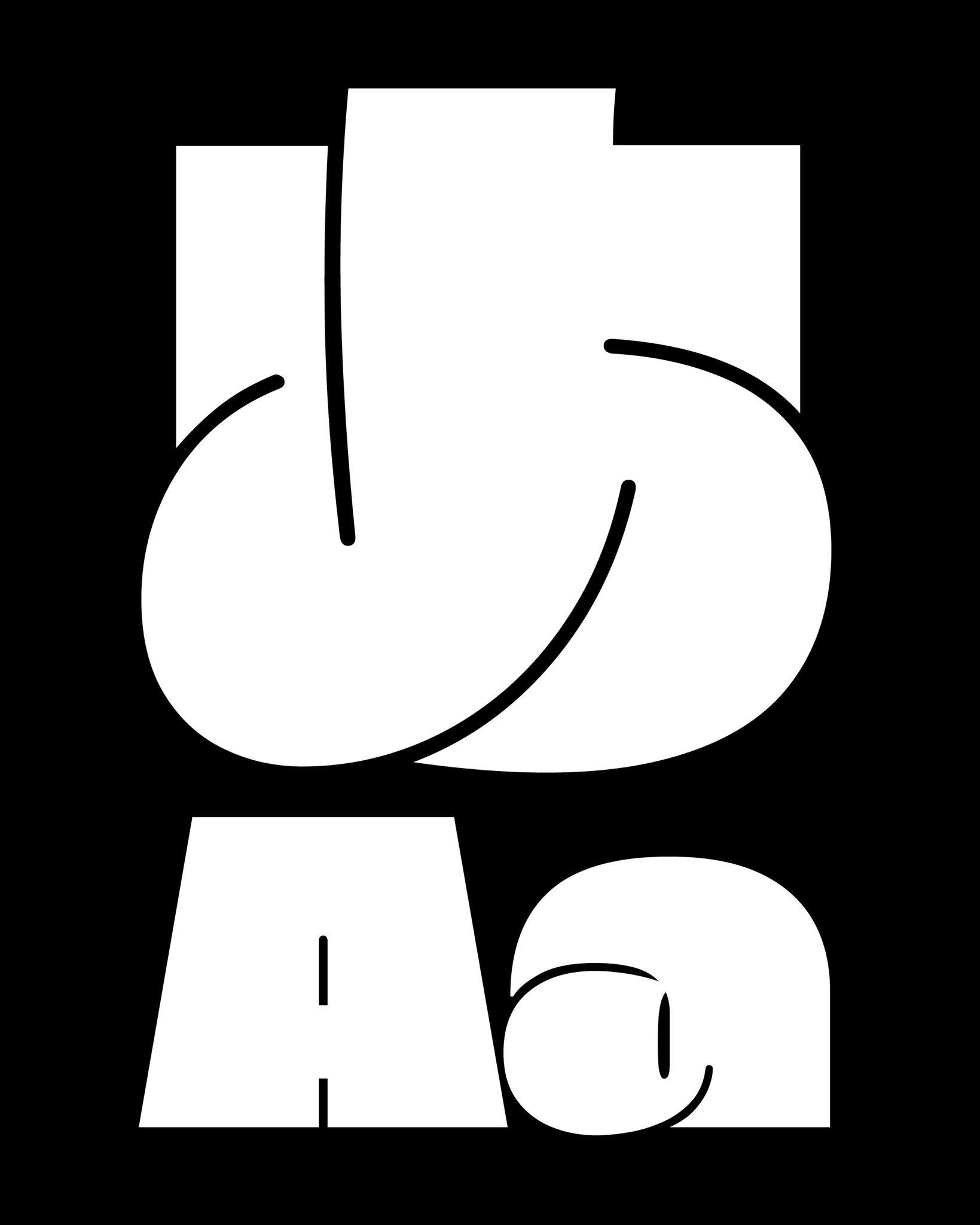
Get to know Spritz!
With no filled forms, its letters emerge from the negative space, casting airy, fluid silhouettes. Fully rounded and capitalized, Spritz plays with depth, motion, and intrigue rather than pure legibility.
black-foundry.com/arch/fonts/spri…

Jeremie Hornus retweeted
Genepi is a typeface inspired by the iconic lettering of Tavern on the Green. With its flowing wave effects, Art Nouveau charm, and advanced variable axes, it offers endless creative possibilities.
black-foundry.com/arch/fonts/gene…


Jeremie Hornus retweeted
Introducing Absinthe, a typeface born from Tavern, the wavy and experimental tool.
Inspired by the free-spirited energy of the 60s, Absinthe is playful, fluid, and unapologetically groovy. Discover Absinthe on our website:
black-foundry.com/arch/fonts/absi…


Jeremie Hornus retweeted
Introducing Jack, a typeface born from Tavern, the wavy and experimental tool
Jack is bold, robust, and unapologetically modern. Its simplified forms strip away the unnecessary, creating a raw yet refined structure that commands attention.
black-foundry.com/arch/fonts/jack…


Jeremie Hornus retweeted
The Tavern minisite blends type inventiveness with variable font technology, enabling you to create stunning intricate visuals—animated or not. TAVERN is a space to explore what happens when typography breaks free from static forms. 👌
Discover here:
experiments.black-foundry.co…


Jeremie Hornus retweeted
Here is Ampere, our very latest font release! Ampere stands out with a refined, grid-like precision that speaks to its modern design ethos. Discover more on our website 😍
black-foundry.com/arch/fonts/ampe…
