designer, of sorts 🪄 @browsercompany
Joined May 2020
- Tweets 1,188
- Following 531
- Followers 13,351
- Likes 7,254
Lastly, the iconic former website is archived on 2020.thebrowser.company — in case you get nostalgic :)
Today we launched a new company website! a new site for a new era — but not without our usual flair. One of my favorite details: the footer is inspired by fictional HUDs, showing off our old logos ✨
We also have a new company website – inspired by @pgLang and designed by our rising star, @milkjuus:
thebrowser.company
here's the skill, if you want to look into the mirror: diabrowser.com/skills/graham
i ran /graham on my twitter profile + some of my old websites ... and it's accurate, i fear
I’ve been evaluating people using my @diabrowser /skill.
It’s called /graham and It’s scary good.
Watch me test it on a few victims live (incl. @nikitabier )
jess retweeted
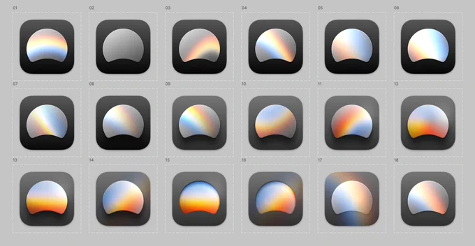
New @diabrowser app icon hotness from @milkjuus
Which is your favorite? I’m partial to #9 and #14…
jess retweeted
I wrote about the design of Dia.
- How did the @browsercompany design team rally around the idea to make a ‘boring’ web browser?
- What purpose does the design serve?
- Where is Dia’s design going next?
psst ... new website alert!
Very proud of our first marketing website for Arc Search, made by @milkjuus @DevinLewtan & Co. Arc Search is coming to Android very soon too!
jess retweeted
Very proud of our first marketing website for Arc Search, made by @milkjuus @DevinLewtan & Co. Arc Search is coming to Android very soon too!


